
Non-white Paint Colors That Add Character
If you’re looking for paint colors that bring personality to a space without feeling bold or overwhelming, these three favorites are worth considering.
If you’re looking for paint colors that bring personality to a space without feeling bold or overwhelming, these three favorites are worth considering.
Woodlawn Blue by Benjamin Moore
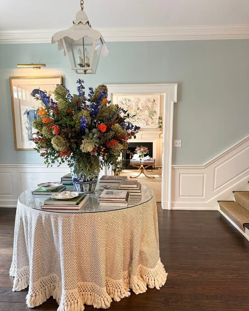
In a two-story foyer with semi-good natural light, this soft blue feels fresh, inviting, and perfectly southern. It’s light enough to keep the space open, yet adds just the right amount of color. I especially love how it looks paired with creamy white molding—it highlights the architecture and gives the entryway a timeless charm. See the full home tour with Kate Morrison from Eastover Collection here.
Light Blue by Farrow & Ball
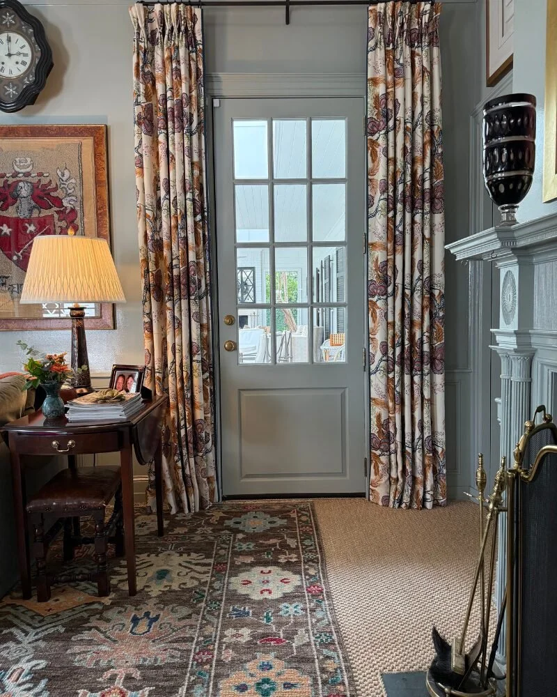
This cozy den proves that soft color can still feel rich and layered. Farrow & Ball’s Light Blue creates a soothing backdrop that plays beautifully with warmer tones—think browns, reds, and deep blues. It adds depth and character to smaller rooms, making them feel intimate rather than dark. See my full home tour with Mary Margaret Underwood here.
Tissue Pink by Benjamin Moore
In another entryway, Tissue Pink offers the faintest blush of color. I didn’t even notice it was pink until I looked back at photos—it’s that subtle. This hue adds a gentle, feminine touch without feeling too sweet, and pairs effortlessly with greens, blues, and creamy neutrals. See my home tour with Kate Figler at her Nashville, TN home here.


4 Inspiring Home Tours from 2024 — Plus Perfect Paint Colors
As I’ve continued to get to know my wonderful audience, one thing is clear: y’all love pretty homes and specific paint colors! It’s one of my top requests. So today I thought I’d reshare some of our favorite homes and paint colors used in them.

This year we were so lucky to take a peek inside some of the most stunning homes across the South. Whether we were able to stop by in person or admire from afar, I’m feeling so inspired looking back on our year.
As I’ve continued to get to know my wonderful audience, one thing is clear: y’all love pretty homes and specific paint colors! It’s one of my top requests. So today I thought I’d reshare some of our favorite homes and paint colors used in them. (Hint: Next week we’ll focus on wallpaper!)
Let’s take a look.
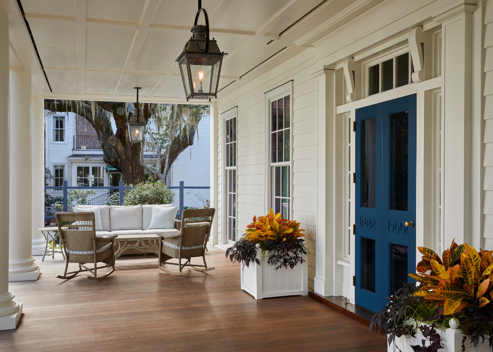
This Isle of Hope estate was so inspiring we created one blog post for the exterior and one for the interior! The curb appeal is so idyllic and I love the pop of color the front door provides. It’s in a gorgeous blackened teal blue.
Front door: Gentleman’s Grey by Benjamin Moore
Exterior: Glacier White by Benjamin Moore


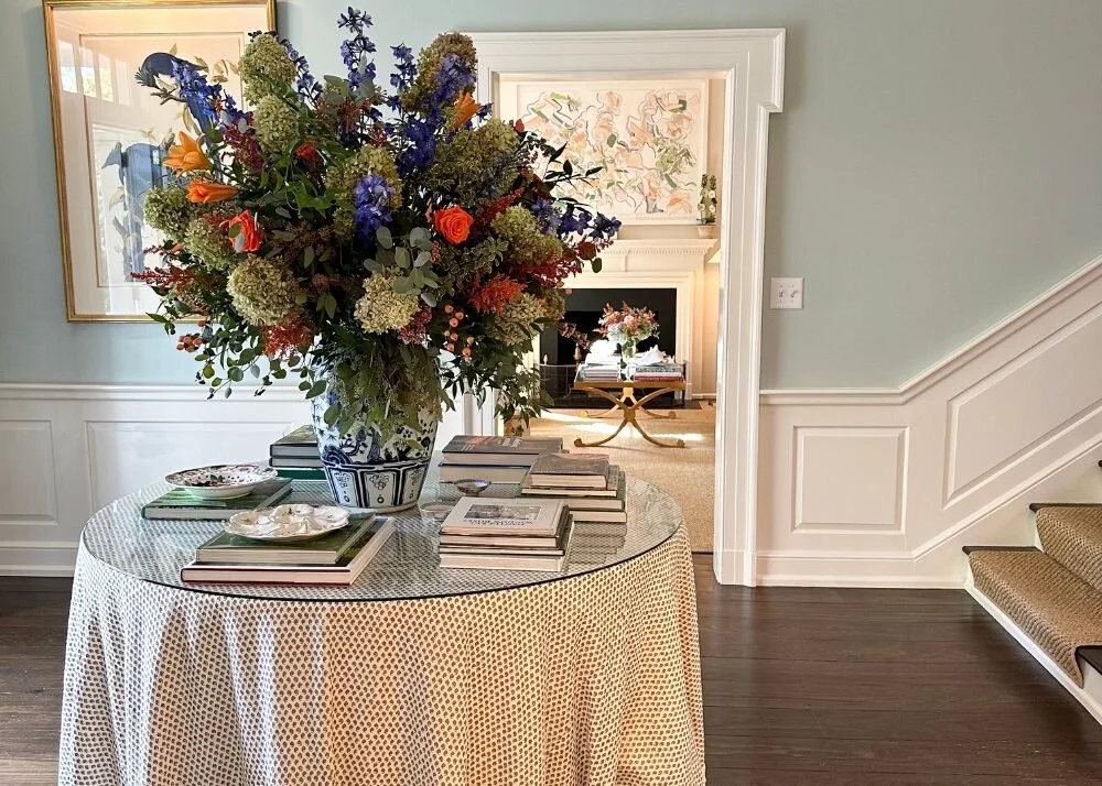
Kate Morrison’s storied Concord home gives you a sense of ease and delight. I think that has a lot to do with the gentle blue and green color pallete and the emphasis on floral textiles and botanicals throughout.
Foyer: Woodlawn Blue by Benjamin Moore
Hallway: Chappell Green by Farrow and Ball
Kitchen cabinets: Downy by Sherwin Williams
Scullery cabinets: Mizzle by Farrow and Ball.


We love a good before and after and Molly Basile’s Charleston home is no exception. The sanctuary of style — and comfort — is filled with Southern charm. She shows us neutrals are never boring!
Front porch ceiling: Borrowed Light by Farrow & Ball
Exterior painted brick: 50/50 mix of Swiss Coffee and White Dove by Benjamin Moore
Shutters: Balboa Mist by Benjamin Moore
Kitchen cabinets: White Dove by Benjamin Moore
Mudroom cabinets: Parma Gray by Farrow & Ball


I always like to show examples of well-preserved architecture, so touring this 1930s Charlotte home was really special to me. I love the rich, creamy beiges they used in this one.
Kitchen cabinets: Accessible Beige by Sherwin Williams
Living room: Balanced Beige by Sherwin Williams


In case you missed it... I share some tips for refreshing your dining room and how I balance family-friendly living with elegant design.
6 Tips for Styling Your Conversation Room
Picking the perfect paint color for your front door is a tough choice—here are 10 designer-loved options.


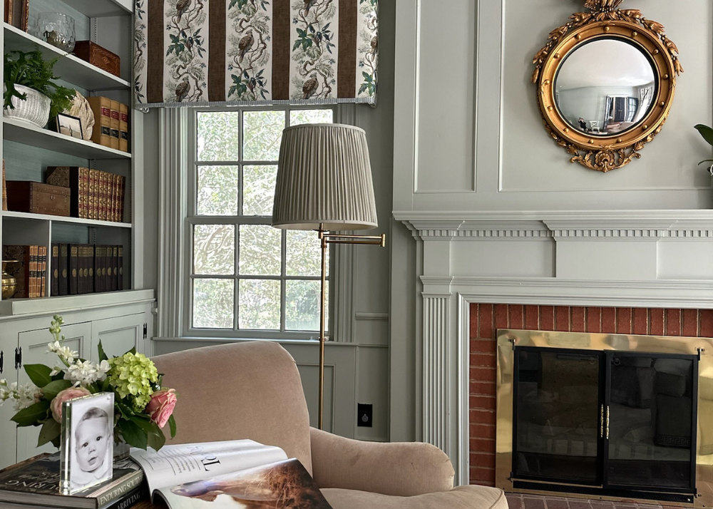
Today I'm giving you a tour of my personal conversation room! If you've been following on Instagram, you know my Charlotte, North Carolina home renovation has been a true labor of love—and if you've been through a reno, you know how accurate that cliche is.
I'm not sure I'll ever feel completely "done," but I love how this room has come together over the years. It's comfortable and cozy, while still having that classic, sophisticated flare that makes my design-loving heart happy. Here's what I learned styling this space.
1. Paint goes a long way
We loved the color of this room when we moved in, but a few spots needed a touch-up. I couldn't imagine the room any other color, so, we did a Sherwin-Williams custom color match. Paint colors are by far the most-requested resource from the Garden & Grace community so I'll share the exact formula below.


2. Mix old and new pieces
We shared a post recently all about incorporating English antiques, and this room is more proof that mixing old and new pieces is the key to building character in a space.


3. layer in lighting
We've said it before, lighting plays an important role in communicating style and setting the mood. I was so honored to work with Pooky Lighting for this room! I went with a swing articulated floor lamp with a pleated shade in keeping with my traditional style.

4. Consider custom window treatments
I credit our custom window treatments for really giving our conversation room that tailored, clean look. I used a Thibaut fabric for the cornice boards and Schumacher for the drapes, in collaboration with my dear friend Laurin at Cambridge Row. The pop of color and pattern brings me so much joy every time I catch a glimpse of this treasured room.


5. Add Personal items
Beautifully framed photos, coffee table books and an orchid add so much personality to this room. They're easy to swap out each season, too, which helps keep this space feeling fresh and current.


6. Rugs Pull A Room Together
I worked with Cambridge Row and English Village Lane to design a custom rug that coordinates with my walls and window treatments. The topiary boarder we created is so special—and the perfect nod to Garden & Grace. It really helped this space feel even more cohesive and layered. You can actually buy my exact rug!


Want to see more of my personal home? My powder bath and our kids' bathroom are on the blog!
SHOP CONVERSATION ROOM ACCESSORIES


