
Home Tour: A Renovation Story from 1990s to Timeless Family Home
In the heart of Charlotte, NC Mannerly founder, Elizabeth Anne, and her husband, Drew, thoughtfully remodeled a home that tells the story of vision, patience, and timeless design. Over the past three years, they've transformed an outdated 1990s house into a refined family home that honors classic architecture while flowing effortlessly for their modern lifestyle.


I recently had the opportunity to tour a beautifully reimagined Charlotte home that began as a dated 1990’s build and, over the course of three years, was transformed into a timeless residence full of character and warmth.
With Whittington Builders leading the construction, architect Kent Lineberger shaping the vision, and Whitney Sturge Interiors—along with finishing touches from Allison Davis Interiors—curating the interiors, every detail was thoughtfully considered. The homeowners, a young family of five with a love for entertaining, played an active role in the process, ensuring the design not only celebrates classic architecture but also flows seamlessly for family life.
You may have seen the Instagram feature I shared on this home earlier this week. It’s here if you want to take a look but I’ll share all the details, paint colors and sources below! A longer version of the home tour is also available on the Garden & Grace YouTube channel.
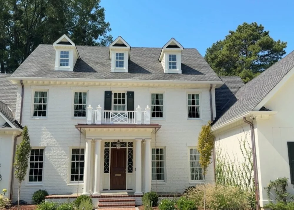
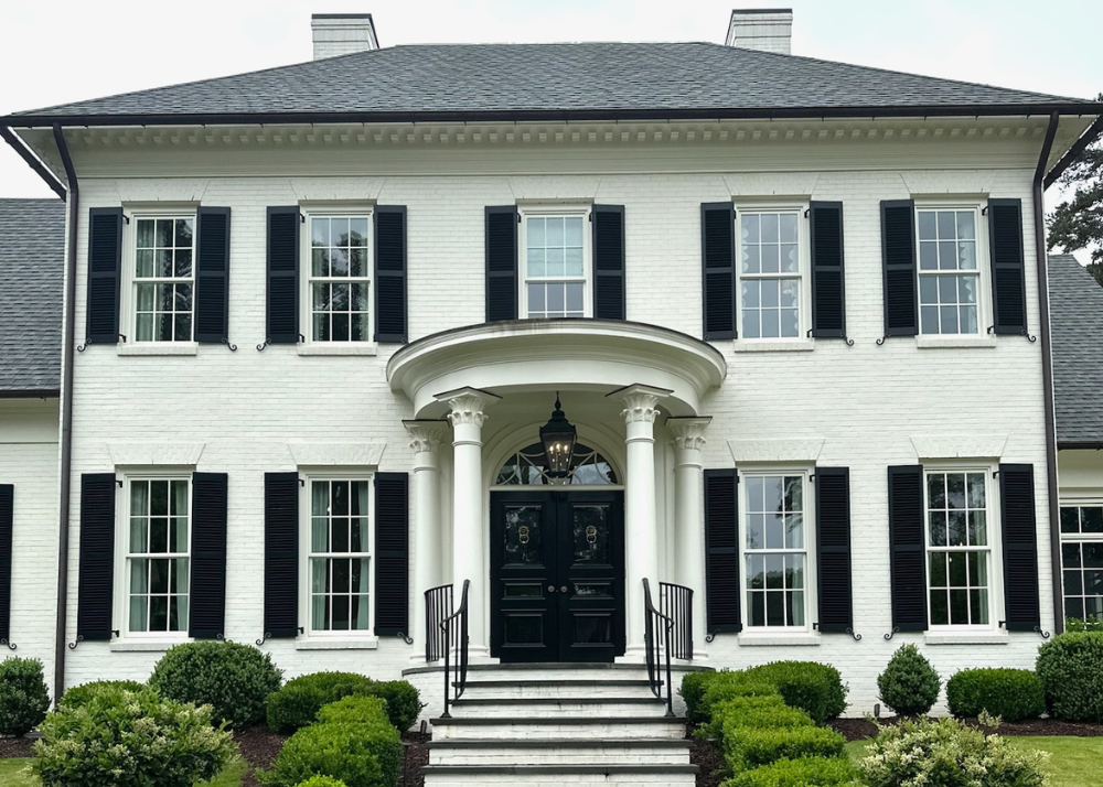
 THE EXTERIOR
First things first! The exterior paint colors that balance stately and charming curb appeal. The exterior brick paint color is Benjamin Moore Dove Wing and the shutters are Benjamin Moore Essex Green.
The exterior received just as dramatic a transformation as the interiors. The original two-story portico and columns were replaced with a more proportionate, detailed portico, complemented by the addition of three charming roof dormers that lend balance and architectural interest. The home was expanded at the rear to accommodate a new kitchen, family room, breakfast room, second-floor primary suite, third-floor office, and inviting outdoor spaces including a covered patio and firepit terrace. Additionally, the stucco surfaces were refaced and enhanced with brick headers, all windows and doors were replaced, and the property was completely reimagined with a new driveway, lush landscaping, and the addition of a garden folly—altogether creating an exterior that feels classic, enduring, and perfectly scaled.
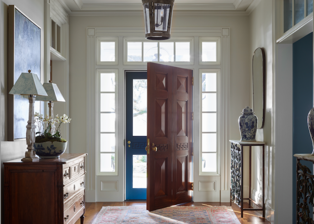
Elizabeth Anne, founder of Mannerly (formerly Charlotte Etiquette) is pictured below in her new doorway with custom designed sidelights.


 THE ENTRYWAY
Stepping inside, the entryway immediately sets the tone for the home’s refined, traditional aesthetic. Spacious and welcoming, the foyer is defined by its beautifully detailed trim and molding, all painted in Benjamin Moore’s White Dove in a crisp semigloss finish that highlights the craftsmanship. Clarence House’s iconic “The Vase” wallpaper in Ecru adds a layer of timeless pattern and texture, creating a graceful backdrop for the architectural detailing. The stair foyer continues the palette with walls in White Dove and ceilings softened to 50% strength in a flat finish, lending subtle contrast and depth while keeping the atmosphere bright and elegant.
A discreet jib door blends seamlessly into the paneled walls, cleverly concealing a closet for storing the children’s toys—proof that beauty and practicality were given equal attention in this redesign. Keep scrolling to see the entryway before the dramatic renovation which serves as a reminder that with the right vision and design team any space can be transformed.


 THE KITCHEN, SCULLERY & BAR
The kitchen is the true heart of the home, designed with both family living and entertaining in mind. Custom cabinetry painted in Farrow & Ball Shaded White creates a warm, timeless foundation, with walls in eggshell and trim, doors, and cabinets finished in satin for subtle dimension.
Overhead, large pendants from Lantern & Scroll—finished in a custom color to echo the adjoining scullery—add a whimsical touch.
High-performance appliances anchor the space, including a Wolf range, oven, and steam oven, a Miele refrigerator and freezer, Asko dishwashers, and a Liebherr wine fridge, all integrated seamlessly into the design. Together, these elements create a kitchen that balances modern functionality with traditional elegance. The before image of the kitchen is below, a striking reminder of how thoughtful design and craftsmanship can completely reimagine the way a home lives.


The adjoining scullery itself is a jewel box, with cabinets, walls, and trim enveloped in Farrow & Ball Lichen.

The bar which is the connection point between the dining room and scullery, with easy access from the family room and family room, is drenched in Benjamin Moore White Dove to seamlessly tie into the entryway. It's complete with trim rich custom cabinetry, a wine cooler and a hammered round bar sink.


THE LIVING SPACES
Flowing seamlessly from the kitchen, the family room continues the palette with walls, trim, and built-in bookcases all painted in Benjamin Moore’s Shaded White. A wide cased opening defines the transition between the two spaces, keeping them visually connected while still giving each its own presence. The room is anchored by a classic Visual Comfort ring chandelier and grounded with a neutral rug and coffee table that balance the color story. Two blue sofas and a pair of green Lee Industries chairs bring depth and comfort, while ornate details—like the Modern Matter hardware on the bookcases, the gold-framed Samsung Frame TV, and the molding along the fireplace—lend a sense of refinement. One of the most striking details is the trim work on the ceiling, adding dynamic interest and a sophisticated layer to the architecture.


Tucked away from the main living spaces, the study offers a cozy retreat painted in Farrow & Ball’s Oval Room Blue, a rich hue that brings both depth and calm to the room. Built-in shelving frames the space and is filled with meaningful family heirlooms, making it as personal as it is beautiful. Serving double duty as a home office and a private spot for girls’ mahjong night, the study is a perfect example of how thoughtful design can blend function with warmth.

THE DINING ROOM
The dining room has incredible thick molding painted in Benjamin Moore White Dove with a semigloss finish. The entire dining room is a study in timeless elegance, wrapped in Iksel’s Imperial Garden wallpaper in Celadon—a backdrop that brings depth, texture, and quiet drama to the space. At the center, heirloom antique pieces—including the dining table, chairs, and buffet—anchor the space with history and meaning, making it as personal as it is beautiful. A neutral, high-traffic rug grounds the room and ensures it functions seamlessly for a family with young children—I’ve linked a similar one for you here.


THE COVERED PORCH
The covered porch serves as a true retreat, perfectly positioned to overlook the backyard while offering comfort in every season. Designed with both beauty and function in mind, it features built-in outdoor heaters, classic copper lanters, and a flat coffered ceiling detailed with tongue-and-groove boards.


Copper caps crown each column—an elegant touch that protects against rot while introducing a sophisticated detail that will only grow richer as the metal patinas over time. The dining table and chairs are the Calcutta by Brown Jordan and the outdoor sofa and chairs are from One Kings Lane and while no longer available I'm linking similar ones here — together they create inviting spots for gathering. One of my favorite design features is the chippendale railings that add an extra level of southern flare to the porch. The homeowners had them custom made by Carolina Decks. The porch is covered with bluestone pavers, a high-end finish, providing the perfect contrast to the creamy white exterior and fresh white outdoor furniture.
THE BATHROOMS & LAUNDRY ROOM
The primary bath feels serene with custom cabinetry, Benjamin Moore White Dove trim, and walls in Sherwin Williams Misty. A chic vanity stool (linked here) adds charm, while classic Visual Comfort sconces (linked here) prove why they remain a timeless choice.


Fresh and sweet, the girls’ bath pairs White Dove walls with Farrow & Ball Cinder Rose trim and cabinetry. An adorable mirror (linked here) completes the look with a touch of personality.
Just beyond, the laundry room continues the playful palette with cabinets, trim, and doors in Sherwin Williams Pink Shadow. Outfitted with two washer-dryer sets, a windowed sink, and generous storage, it’s as hardworking as it is charming. A checkered tile floor and half-glass door finish the space with both function and character.
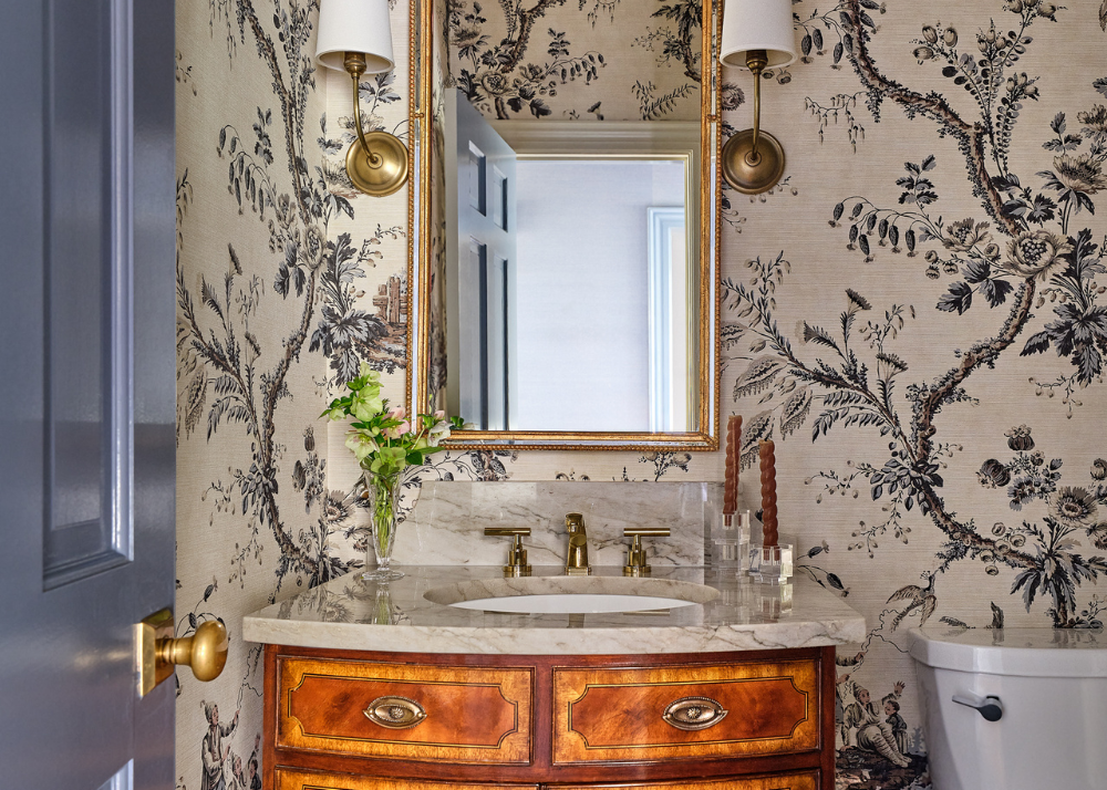
Downstairs, the powder room strikes the perfect balance of playful and elevated, with Farrow & Ball Pink Ground on the cabinets and trim paired with a lively patterned wallpaper.
BONUS CONTENT!
Beyond the main living spaces, the home is filled with thoughtful details that carry its classic character into every corner. The drop zone and mudroom strike a balance between function and style, with walls in Benjamin Moore’s White Dove and trim painted in Farrow & Ball’s Parma Gray in a satin finish. Modern Matter hardware adds a playful yet polished touch, making these hardworking spaces feel elevated.
Upstairs, the children’s playroom showcases the same custom railing design featured outdoors, crafted by AndronX of Indian Trail, NC, whose work also defines the stair railings throughout the home. Painted in Benjamin Moore’s Prescott Green, the playroom walls and trim create a subtle wash of color that feels both cheerful and timeless—perfect for a kids’ space. Their son’s bedroom continues this thoughtful use of color, with walls in White Dove and trim, doors, and cabinetry in Benjamin Moore's Serenata, a soft, refreshing blue-green in a semigloss finish.
Outdoors, the vision extends seamlessly to the landscape. Designed by Greenline Design and expertly installed by Audrey Kemp, the grounds complete the home’s transformation, balancing structure and softness to complement the architecture.


This home is a testament to what can be achieved when vision, craftsmanship, and collaboration come together. Drawing inspiration from some of the most respected names in classical architecture—Charles Hilton Architects, C. Brandon Ingram, VanderHorn Architects, Patrick Ahearn, Spitzmiller & Norris, and Purple Cherry Architects, among others—the homeowners approached their remodel with both reverence and creativity. Their “architectural bible,” Get Your House Right, served as a guiding resource throughout the process, ensuring every proportion, detail, and decision honored timeless design principles. The result is a home that feels both enduring and deeply personal, a modern-day classic designed for family life and gracious entertaining.
SHOP THE HOME


How to Design a Classic Boys Bedroom
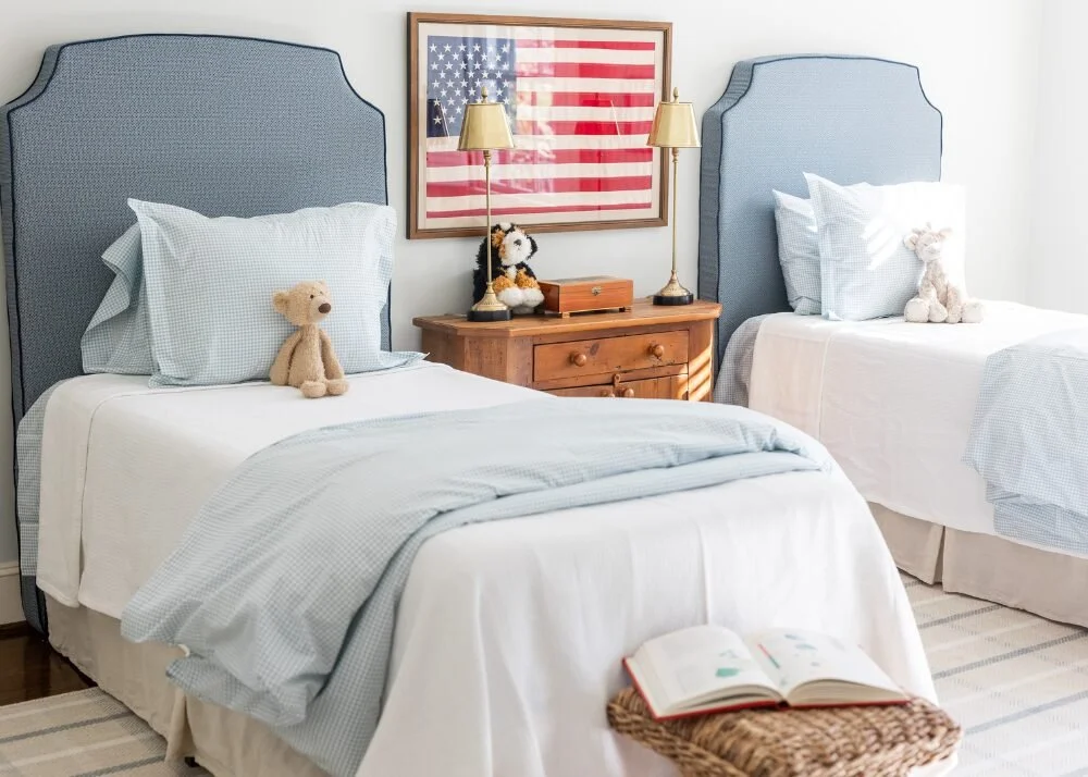
When we moved into our home in late 2022, I was 38 weeks pregnant and had to press pause on decorating my oldest son’s room. A few years (and plenty of Pinterest saves) later, I finally created a space that feels both playful and timeless—with an Americana theme, smart mix of high and low pieces, and kid-friendly practicality. In the blog, I’m sharing my favorite tips for designing a child’s room that grows with them, stays stylish, and can handle the real-life messes. Whether you're starting from scratch or refreshing a space, this post is full of inspiration and real-mom advice. Come take a peek inside Perry’s new big boy room!


When we moved into our home late 2022, I was 38 weeks pregnant with my third and eager to move in before the baby arrived. That meant, waiting on some projects I knew I wanted to do. Including decorating my oldest child's bedroom! A few years later and I finally gave my sweet oldest, Perry, a proper big boy room. Here's my advice when decorating a kid's bedroom to ensure it will grow with them for years to come!

1. Picking a color scheme / style
If you're anything like me, you have a Pinterest board or assortment of Instagram images saved to "Kids Bedroom." Maybe it's just me. But I used those images to settle on a style for his room.
For years, I have been saving down Americana themed boy rooms so I knew going with that color scheme would be a tried and true design for me. I wanted a tattersall style rug to give the room a playful, soft base, and I landed on this Tori Rug from Stanton Carpet. From there, I built the rest of the room.

2. Invest in some, save on others
I'm big on finding pieces that will last and stand the test of time that are worth investing in. Then layering in pieces that I already own or that I find at antique shops or off Facebook marketplace.
For this room, the rug and the headboard are investment pieces that anchor the room. The headboard, custom designed with Coley Home, was an important piece of the design puzzle for me. Since Perry's room already had plantation shutters, I didn't plan on doing other window treatments. I knew I wanted to bring color and warmth in with upholstered headboards.


3. Remember, they will be kids
I love good design but I'm also a realistic mom of 3 kids under 6. Things get messy.
I didn't go over the top with wallpaper or expensive bedding or even a new bedside table. Instead, I painted the walls in a flat Sherwin-Williams Nonchalant White making it easy to touchup, selected cute and affordable bedding and found an antique, distressed dresser to place in between the two twin beds since I knew it would be covered in Legos and Hot Wheels.
The lamp and lampshade are from Ballard and the white dresser is a Pottery Barn Kids classic that I've had for years. It's still available online. I get asked a lot of about the mirror, too! I have several mirrors from Winstons Collection, including this pretty navy one in Perry's room.
You can read more of my thoughts on designing a kids' bedroom on the Coley Home blog I was featured in this month!


LITTLE BOY ROOM DECOR


Home Tour: See inside designer Kate Figler's personality-packed Nashville home
Interior designer Kate Figler graciously welcomed us into her 1945 Nashville home — designed by beloved architect Edwin Keeble — for a picture-perfect tour. If you think the outside is charming, just wait until you explore the interiors.TKTKT

This home tour is presented by Tuckernuck, a brand both Kate and I adore — and now even more because they offer the same quality and style for the home! You can shop our exact looks and Kate's fabulous fall tablescape directly in this post.
![]()

Interior designer Kate Figler graciously welcomed us into her 1945 Nashville home — designed by beloved architect Edwin Keeble — for a picture-perfect tour. If you think the outside is charming, just wait until you explore the interiors.
The house color is Benjamin Moore Soft Chamois OC-13 and the shutters are a true black like Benjamin Moore Black 2132-10. The roof existed before Kate made the home her own, but its similar to GAF’s Charcoal color for its asphalt shingle lines.

"I love its classic Cape style exterior as well as the charm of its interior architectural details like the curved entry staircase and the low archway leading into our powder bath," Kate says of her stylish home.
Let's step inside that iconic entryway, painted in Benjamin Moore Tissue Pink 1163. The powder room was like a secret hideaway dressed in Scalamandre Raphael Green wallpaper.


Original charm is abundant, and Kate’s designer eye is showcased in every room. From the original curved staircase to the Dutch door in the dining room, it’s easy to get lost in this enchanting and large family home.
This family den is painted in Benjamin Moore Van Deusen Blue HC-156.

I really admire Kate's ability to work with a lot of color, texture and pattern while keeping the space feeling timeless and edited. This living space for example, features a durable textured rug, a deep cozy sectional and fun botanical prints. "The color palette throughout our home also feels very joyful and like a true expression of our family. Every room is bright, comfortable and approachable — all our furniture is meant to be cuddled up on and lived in," Kate says.


One of my favorite rooms in the house is the dining room. Can you imagine the dinner parties? Swoon.
The walls are covered a beautiful purple wallpaper by House of Harris. I love how the Tuckernuck fall home finds pull in some of those plums, purples and browns. The florals are grounded with tortoise tumblers and rattan placemats. The chairs keep the room comfortable.


The kitchen has the most gorgeous wall of windows, making the space feel bright and open. The runner really ties in the color you see throughout the rest of the home. The kitchen walls and cabinets are painted in one of our all-time favorite, classic paint colors: Benjamin Moore White Dove OC-17.


These pantry doors come with the most precious story. The previous homeowners marked their kids' heights on the original pantry and asked to keep them. Kate had these new doors made and went with a purple fabric to tie in the happy hue from the rest of her house.

Kate's layering skills are on full displace in the bedrooms. The canopy over the bed totally transforms the room.


Each corner of Kate's home is so well thought out. There's a careful balance between comfort and style that makes it an ideal Garden & Grace home tour.


To maximize utility for their family home, Kate recently added a walkway, drop zone and a garage with guest quarters above. I love this solution for older homes that sometimes lack the storage family's today crave. While this space is still in-progress, I just couldn't help but show it! Imagine the new exterior of the walkway with boxwoods and hydrangeas. Landscaping went in shortly after my tour!


For more on this home, visit Instagram and the longer version home tour on YouTube coming Thursday, 10/17. Hope you enjoyed this home as much as I did! Special thank you to Kate Figler for opening her home and Tuckernuck for sponsoring it.
SHOP OUR TUCKERNUCK LOOKS


& for the table


Home Tour: This North Carolina Home is Abundant with Timeless Beauty
It’s hard to believe we’re settling into the last few months of the year. And as the leaves begin to fall, it’s actually the perfect time to start thinking about your 2025 garden. Here's what the pros from our Garden & Grace directory suggest.

This summer we took you on a tour of Kate Morrison's storied Concord, North Carolina garden. She's the owner of Eastover Collection, where she designs custom planters, garden accents and window boxes. Lucky for us, her timeless taste is just as present inside her home as it is throughout her garden designs.
Let us show you around her thoughtful, classic home.
Moving through Kate's home, you feel a sense of ease and delight. I think that has a lot to do with the gentle blue and green color pallet and the emphases on floral textiles and botanicals throughout.


The foyer welcomes you with Benjamin Moore's Woodlawn Blue. Farrow and Ball Chappell Green, used in the small hallway leading to the guest room, is a beautiful blend of blue and green.


She balances the soft colors and patterns with strong moldings, clean lines and detailed millwork. No room shows this balance better than the kitchen. It's incredibly charming, and I love the use of Sherwin Williams' Downy on the cabinets and Calacatta Borghini Extra countertops. These elements bring so much warmth to this inviting space. Instead of canned lights, the kitchen is accented with these beautiful flush mount lights for a more elevated look.


One of my favorite rooms in the house is the scullery. I love the utility of a workspace, sequestered from your entertaining spaces. Kate's is filled with ample storage and style. The cabinets are painted in Mizzle, a soft gray-green by Farrow and Ball.


In our first tour with Kate this summer, she told us she always wants her guests to feel relaxed and happy. That's apparent in each room of her home. The artwork, paneling and rolled-arm silhouettes make this living space feel sophisticated, while the conversational setup and soft layers feel inviting.


Kate's garden is one of our favorite spaces to date, and her planters and obelisks are part of what makes it so special.


Craving more inspiration? See our previous home tour with a Charlotte artist who's not afraid of color and personality-packed rooms.
SHOP THE HOME


5 Ways to Create a Timeless Nursery
So many memories are made in those first few months, and having a special space to soak it all in really is a dream. Here's what I've learned from studying the pros, and after designing nurseries for my own little ones.
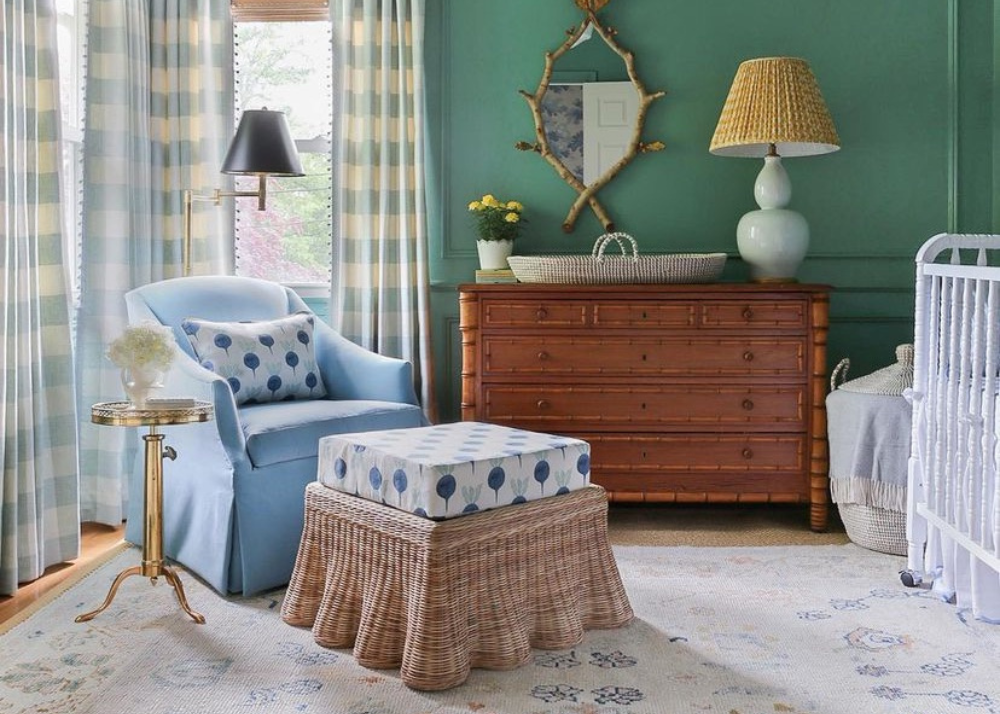

Today we're talking all about nurseries! I have saved so much inspiration over the years, as these sweet little spaces always make me smile. So many memories are made in those first few months, and having a special space to soak it all in really is a dream. Here's what I've learned from studying the pros, and after designing nurseries for my own little ones.
Try A Tonal Look
One designer trick I've learned over the years is to choose one color when you're dressing up a space, from crib skirts to wallpaper. In a nursery, blues, pinks, green or neutrals work really well—and these photos are proof.


Play with Wallpaper
A nursery is a great place to incorporate whimsical wallpaper. Florals and stripes are classic choices, but you can always go with something a little more bold and keep the rest of the space simple. Pair your wallpaper with well-constructed window treatments and your little one's space will strike the right balance between polished and playful.


Frame Murals and Panels
If want the look of wallpaper without the commitment, consider framing a pair of panels or a mural. Paint the walls a complementary color so make it feel cohesive. I like how this option allows the room to easily grow with your child.


Mix in Natural Materials
Whether its a stack of wicker baskets, an antique dresser or bamboo blinds, I like mixing natural materials into a space to help ground it. These materials help add warmth and dimension, especially if you're drenching a room in color otherwise.


Make A Cozy Seating Area
You'll probably spend quite a bit of time in this room, so make sure there's a space designed for those late-night snuggles. I've found the winning combination is a glider, ottoman, side table and light. If you have space, a daybed is a great option, too.


SHOP MY NURSERY PICKS


Before and After: My Personal Bathroom Renovations
Today I'm sharing some before and after images from my personal home's powder bath and boys' bathroom. My husband and I bought our 60-year-old house in 2022, and have been making it our own ever sense. I hope you enjoy!

Today I'm sharing some before and after images from my personal home's powder bath and boys' bathroom. My husband and I bought our 60-year-old house in 2022, and have been making it our own ever since. I hope you enjoy!
Powder bath
I had the honor of working with Zoffany for our powder room—an absolute dream. I wanted something to play with the antique vanity and slate floor tiles, and complement the rich blue grasscloth and trim color in the hallway.


I landed on Emperor’s Musician in Charcoal. This beautiful chinoiserie scenic paper is inspired by oriental draughtsman Jean-Baptiste Pillement. The textured finish adds the warmth the room needed—and it’s even better in person. I also lightened the space by painting the interior trim, door and ceiling Farrow & Ball Old White No 4. I love how it pops against the slate floor tiles.


boyS' BATHROOM
We made some big changes to this small space, and I couldn't be happier with how it turned out. We created more square footage by pushing the tub back 5 inches into the closets behind it, and replaced doors with pocket doors to save even more space. We also took the bathtub tile all the way up to the ceiling, and put in a framed mirror that matched the detailing and color of the cabinets to make the space feel bigger.


We went with Benjamin Moore's White Dove for the cabinet and mirror frame, and Farrow and Ball Chappell Green for the trim and door color. The wallpaper is Farrow and Ball Closet Stripe 357 from a local Charlotte wallpaper shop called Celedore. They also offer online shopping and shipping across the U.S. I love how cheerful the green is, and how playful the stripes are.


All images are by Dustin Peck Photography. Read more about the renovation process here. Follow @garden_and_grace for more home renovation updates.
shop powder bath accessories


FOR the kids


This Classic Raleigh Home Showcases the Beauty of Blue and White
This classic Raleigh home is proof you can't go wrong with shades of blue and white throughout your home. Here are five rooms where you can incorporate the classic color combination.

Today we're re-sharing inspiration from one of the most-loved Garden & Grace home tours to date. Years later, and the classic Raleigh home still stands the test of time—proof you can't go wrong with shades of blue and white throughout your home. Here are five rooms where you can incorporate the classic color combination.
Living room
A collection of ginger jars on built-in shelves, a pair handsome chinoiserie sofas and fringe-framed throw pillows work together to create a modern interpretation of classic design.


BEDROOM
Used here in a mintier hue—and with pops of pink—this blue primary suite is elegant and relaxing.


POWDER ROOM
A half-bath is the ideal spot to experiment with wallpaper. We love the darker blue floral paper used here, and the light blue painted trim.


BREAKFAST NOOK
Ikat blue and white cushions and woven dining chairs punctuate this playful dining space.

OUTSIDE
Blue cushions bring a nature-inspired pop of color to this white outdoor patio space. A sisal rug and chippendale furniture complete the look.


In the previous post Raleigh-based home builder John Sanders took us on an exclusive tour, and we shared all the details, including specific paint colors for each room. Take the full tour here.
All images are by Garden & Grace. Katherine Connell Design is the main designer with recent additions by Allison Davis Interiors. The landscape design is by Liggett Design Group.
Blue & WHITE TABLETOP INSPIRATION


FOR YOUR CLOSET


See Inside: A Restored Isle of Hope Estate
Once a humble house used as a respite from sweltering Savannah summers, this Isle of Hope estate was recently transformed into a full-time family home.

Once a humble house used as a respite from sweltering Savannah summers, this Isle of Hope estate was recently transformed into a full-time family home. With so much to share, we dedicated an entire blog post to soaking in the curb appeal. Today we're finally taking you inside! We think you'll find it was worth the wait.

This home originally appeared in Veranda, and additional photos (all taken by Emily Followill Photography) have been shared with Garden & Grace by interior design firm Webb Marsteller.
The design team paid homage to the home's original old-world architecture, but nearly every room was repurposed—and totally reimagined. In this corner alone you can see the stately columns with ornate capitals, made much more whimsical with Chinoiserie wallpaper and a bullion fringe corner seat.


We love the strong finishes and bold design choices throughout, especially in the kitchen where the kitchen slab is brought all the way up to the ceiling. The green lower cabinets and wood-toned island make the space feel equally grounded and elegant.


The spiral staircase is one of the home's hero features. The steps are covered in a neutral rug that graciously lets the architecture shine.


It should be no surprise we love the calming, classic blue and white color scheme used throughout the primary suite. A seating area and private balcony make it even more special.


There's so much more to love, so take your time exploring the rest of this beautiful home.


The design team includes: Webb Marsteller and Mary Allison Buzzell (Interior Design), Norman Davenport Askins (Architect), Esposito Construction Inc. (Builder), Reddin Construction (Builder), Witmer Jones Keefer (Landscape Designer) and Milling Land Design (Landscape Installer/Maintenance). All photos are by Emily Followill Photography.
In case you missed it: Tour The Grounds of This Idyllic Estate.
shop more styles we love


