
Non-white Paint Colors That Add Character
If you’re looking for paint colors that bring personality to a space without feeling bold or overwhelming, these three favorites are worth considering.
If you’re looking for paint colors that bring personality to a space without feeling bold or overwhelming, these three favorites are worth considering.
Woodlawn Blue by Benjamin Moore
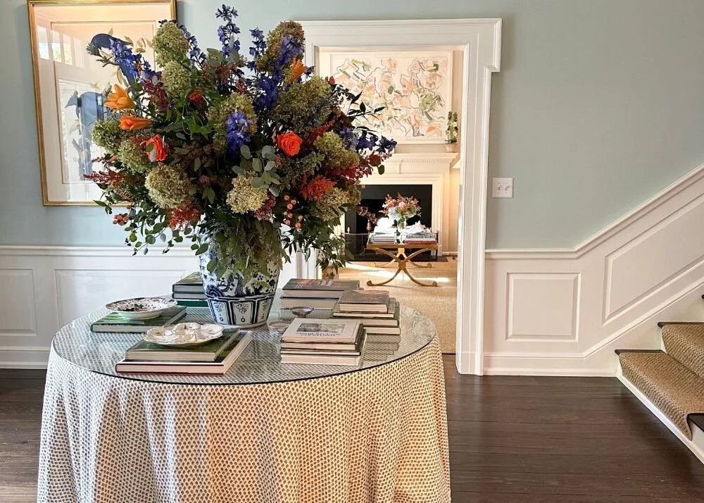
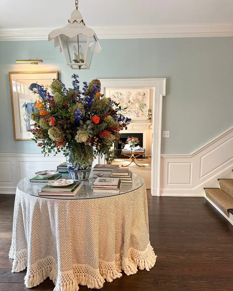
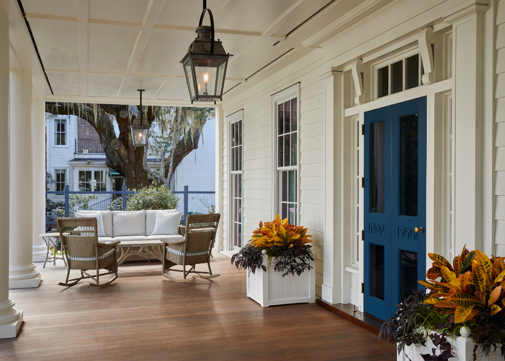
In a two-story foyer with semi-good natural light, this soft blue feels fresh, inviting, and perfectly southern. It’s light enough to keep the space open, yet adds just the right amount of color. I especially love how it looks paired with creamy white molding—it highlights the architecture and gives the entryway a timeless charm. See the full home tour with Kate Morrison from Eastover Collection here.
Light Blue by Farrow & Ball
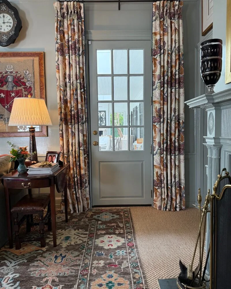
This cozy den proves that soft color can still feel rich and layered. Farrow & Ball’s Light Blue creates a soothing backdrop that plays beautifully with warmer tones—think browns, reds, and deep blues. It adds depth and character to smaller rooms, making them feel intimate rather than dark. See my full home tour with Mary Margaret Underwood here.
Tissue Pink by Benjamin Moore
In another entryway, Tissue Pink offers the faintest blush of color. I didn’t even notice it was pink until I looked back at photos—it’s that subtle. This hue adds a gentle, feminine touch without feeling too sweet, and pairs effortlessly with greens, blues, and creamy neutrals. See my home tour with Kate Figler at her Nashville, TN home here.


4 Inspiring Home Tours from 2024 — Plus Perfect Paint Colors
As I’ve continued to get to know my wonderful audience, one thing is clear: y’all love pretty homes and specific paint colors! It’s one of my top requests. So today I thought I’d reshare some of our favorite homes and paint colors used in them.

This year we were so lucky to take a peek inside some of the most stunning homes across the South. Whether we were able to stop by in person or admire from afar, I’m feeling so inspired looking back on our year.
As I’ve continued to get to know my wonderful audience, one thing is clear: y’all love pretty homes and specific paint colors! It’s one of my top requests. So today I thought I’d reshare some of our favorite homes and paint colors used in them. (Hint: Next week we’ll focus on wallpaper!)
Let’s take a look.
This Isle of Hope estate was so inspiring we created one blog post for the exterior and one for the interior! The curb appeal is so idyllic and I love the pop of color the front door provides. It’s in a gorgeous blackened teal blue.
Front door: Gentleman’s Grey by Benjamin Moore
Exterior: Glacier White by Benjamin Moore


Kate Morrison’s storied Concord home gives you a sense of ease and delight. I think that has a lot to do with the gentle blue and green color pallete and the emphasis on floral textiles and botanicals throughout.
Foyer: Woodlawn Blue by Benjamin Moore
Hallway: Chappell Green by Farrow and Ball
Kitchen cabinets: Downy by Sherwin Williams
Scullery cabinets: Mizzle by Farrow and Ball.


We love a good before and after and Molly Basile’s Charleston home is no exception. The sanctuary of style — and comfort — is filled with Southern charm. She shows us neutrals are never boring!
Front porch ceiling: Borrowed Light by Farrow & Ball
Exterior painted brick: 50/50 mix of Swiss Coffee and White Dove by Benjamin Moore
Shutters: Balboa Mist by Benjamin Moore
Kitchen cabinets: White Dove by Benjamin Moore
Mudroom cabinets: Parma Gray by Farrow & Ball


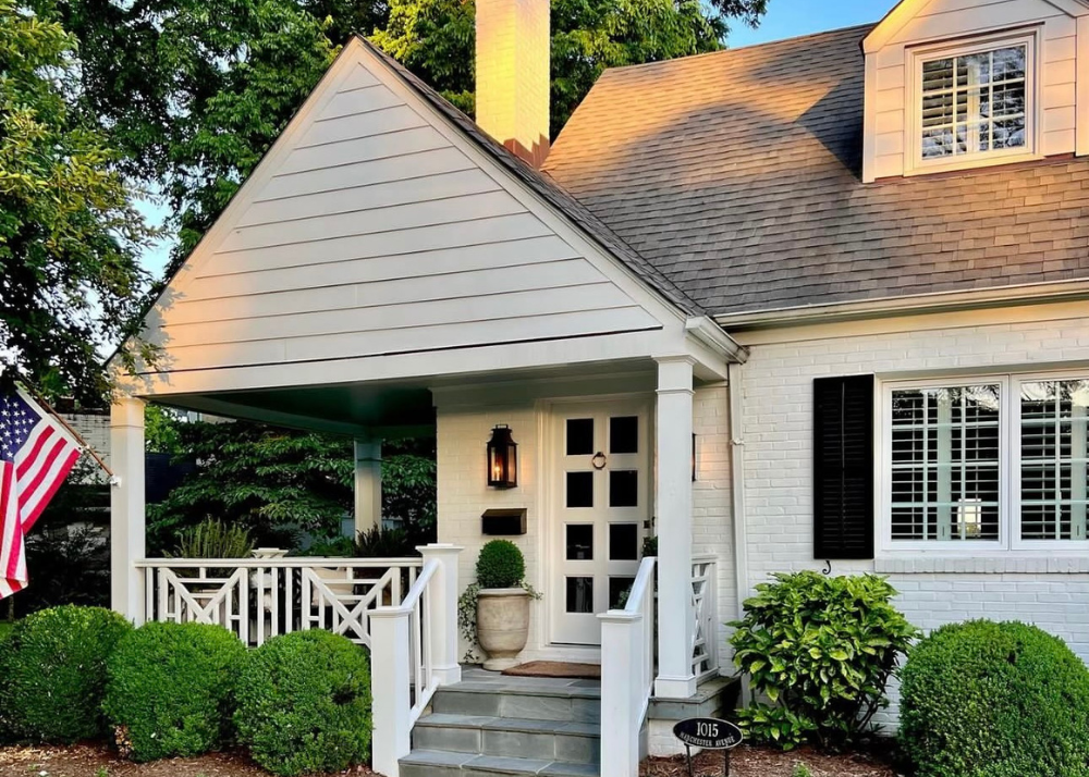
I always like to show examples of well-preserved architecture, so touring this 1930s Charlotte home was really special to me. I love the rich, creamy beiges they used in this one.
Kitchen cabinets: Accessible Beige by Sherwin Williams
Living room: Balanced Beige by Sherwin Williams


In case you missed it... I share some tips for refreshing your dining room and how I balance family-friendly living with elegant design.

10 Classic Front Door Colors
Picking the perfect paint color for your front door is a tough choice—here are 10 designer-loved options.
Find the perfect shade of paint for your front door is a tough choice, but you can't go wrong with a black front door on a traditional white exterior, Interior designer Morgan Britt Howard tells Garden & Grace.
"However, lately I have been drawn to a tone on tone look," Morgan says. Start with a taupe like Benjamin Moore's Revere Pewter for the exterior, and use Clary Sage by Sherwin Williams for a pop of tonal color.
If you're looking for more inspiration, here are eight other front door paint colors that are sure to give your curb appeal a boost.
Everything about this Isle of Hope estate we featured on the blog earlier this summer is a dream. But if there's one thing to copy in your own home, the front door is it. The front door (Benjamin Moore Gentleman’s Grey) has a jewel-like hue to it, beautifully dressed in bespoke brass knobs by Wilmette Hardware.
The 2019 Southern Living Showhouse still inspires us five years later. The design team went with Sherwin-Williams' Blustery Sky for the antique front door—a preview of the old-meets-new charm to come.

Remember when Morgan told us you can't go wrong with a black front door? This home by Chauncy Boothby Interiors is all the proof you need. She used Farrow & Ball Pitch Black—a truly timeless choice.

Another tonal pairing, Cover Me in Ivy captured this Atlanta home with Benjamin Moore’s Swiss Coffee Revere Pewter on the shutters and front door for a traditional look.

This deep, midnight blue (Farrow and Ball Hague Blue 30) is so sophisticated. I love how it reads nearly black in this lighting.

Farrow and Ball Vardo is a whimsical choice for bringing your front door to life—just as Kristina Phillips did here.

This sweet front door is painted in Benjamin Moore's Sugarcane. I love how it breaks up the white but still plays like a neutral here.

You may have seen this one on Garden & Grace before—we just can't get enough. The brick is painted in Benjamin Moore Natural Cream, the perfect backdrop for the Tarrytown Green front door.

The perfect way to accessorize your front door is with a tailored boxwood wreath and statement door knocker. Shop our favorite picks below!


5 Classic Exterior Paint Combinations

Finding the right combination of colors for your home can be tricky. We looked to some of our favorite designers and architects to find the tried-and-true paint color combinations to inspire your next exterior refresh. Like this first one of Lucy Williams' gracious home painted in Benjamin Moore Dune White.
We love Lauren Elaine Interiors' classic brick bungalow. Benjamin Moore Natural Cream serves as the backdrop that allows the Tarrytown Green front door to shine.

If you're looking for a clean, classic white, Benjamin Moore White Dove might do the trick. It's what architect Catherine Sloan used on this restored Nashville treasure. The slightly warm undertones ensures the white doesn't come off too stark.

Blue and white always feels right, and Danielle Rollins nailed the balance here with Benjamin Moore's Cloud White, Polo Blue and Blue Danube.

If you want something a little creamier than White Dove, Benjamin Moore's Swiss Coffee is a popular option—for good reason. We love how the home captured by Cover Me in Ivy paired it here with Revere Pewter on the shutters and front door for a traditional, tonal look.

For a true Southern, Georgian-style home, the design duo at Canvas & Clay recommends Sherwin Williams Natural Choice 7011 with Farrow and Ball Railings No. 31 on the shutters. Railings can read black or navy, depending on the lighting, which provides the perfect contrast.

For more exterior paint colors, check out this Garden & Grace exclusive sneak peek of a large family home in Georgia and a Charlotte family's home transformation.
SHOP MORE EXTERIOR INSPIRATION


shop these classic looks


